


Every department in a growing business generates data — sales figures, leads, revenue, top customers, best-selling products. The challenge is rarely a lack of data; it is finding it quickly without digging through multiple apps and reports.
Odoo 19 addresses this with the Dashboards module, a dedicated app that pulls key metrics from Sales, CRM, Accounting, Inventory, and other modules into a single, visual, real-time view. Instead of opening five different apps to understand how the business is performing, a manager can open one screen and see everything that matters.
This article explains what the Dashboards module does, how it is structured, why it is useful, and walks through the main dashboards available in Odoo 19 using the Sales, Product, and CRM dashboards as examples, before covering how to filter, share, and get the most out of them.
What Is the Dashboards Module in Odoo 19?
The Dashboards module is a reporting layer built directly into Odoo. It automatically organizes data from connected apps — Sales, CRM, Accounting, Inventory, Purchase, and more — into ready-made visual dashboards, grouped by department in a left-hand menu such as Sales, CRM, Finance, and Logistics.
Each dashboard combines KPI cards, charts, and ranked tables so a user can see figures such as revenue, orders, quotations, top customers, and top products without configuring anything manually. Because the module reads live data from the underlying apps, the numbers update automatically as new quotations are created, leads are added, or orders are confirmed.
Unlike a traditional reporting tool that requires a user to build a pivot table or design a custom view before any insight appears, the Dashboards module ships with the analysis already built. Installing the app is enough to get a working set of dashboards for every connected application, which makes it a practical starting point even for a company that has never configured reporting in Odoo before.
The module also acts as a landing page for daily monitoring. Rather than opening the Sales app to check quotations, then the CRM app to check leads, then Accounting to check invoices, a user can open a single Dashboards app and move between department tabs from the same left-hand menu, as shown in the screenshots later in this article.
How the Dashboards Module Is Organized
Inside the app, dashboards are grouped by business function rather than listed as one long menu. In a standard Odoo 19 installation this typically includes:
- Sales — Sales and Product dashboards covering quotations, orders, revenue, and product performance.
- CRM — Leads and Pipeline dashboards covering lead volume, close rate, and open opportunities.
- Finance — Accounting, Invoicing, and Benchmark dashboards covering financial performance.
- Logistics — Warehouse, Operation Analysis, and Purchase & Vendor dashboards covering stock movement and procurement.
This grouping means each department can go directly to the dashboard that matters to them without being distracted by data from other teams, while a general manager can still move across every group from the same screen to get a company-wide view.
Why Use the Dashboards Module?
Bringing performance data into one place is useful for several reasons:
- Faster decision-making — managers see revenue, orders, and top performers at a glance instead of running separate reports.
- Department-specific views — Sales, CRM, Finance, and Logistics each get dashboards relevant to their own data.
- Real-time figures — charts and KPI cards reflect the current state of the business, filtered by a chosen date range such as Last 30 Days or Last 90 Days.
- No technical setup — the dashboards are pre-built and available as soon as the module is installed, with no custom reports to design.
- Easy sharing — any dashboard can be shared with colleagues or starred as a favorite for quick access.
- Consistent figures across teams — because every dashboard reads from the same underlying records, sales, finance, and management all look at the same numbers instead of maintaining separate spreadsheets.
- Trend visibility — charts such as Monthly Sales or Leads by Month make it easy to see whether performance is improving, flat, or declining over time, not just what the current total is.
Step 1: Open the Dashboards App
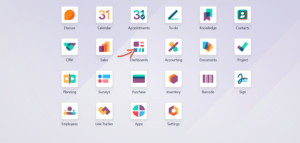
From the main Odoo Apps menu, click on the Dashboards icon. It sits alongside the other core applications such as CRM, Sales, Accounting, and Inventory, so no separate installation step or technical configuration is normally required beyond having the app enabled for the database.
Once opened, the app remembers the last dashboard viewed, so returning users land directly back on the report they use most often rather than a generic landing page.
Step 2: Review the Sales Overview Dashboard
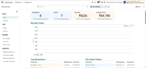
Once inside the Dashboards app, the left-hand menu lists dashboards grouped by department: Sales, CRM, Finance, and Logistics. Selecting Sales under the Sales section opens an overview containing KPI cards for Quotations, Orders, Revenue, and Average Order, followed by a Monthly Sales chart plotted over the selected date range.
Each KPI card also shows the percentage change compared with the previous period directly beneath the figure, so a manager does not have to remember last month’s numbers to know whether performance is improving. The Monthly Sales chart above can be switched between different groupings, such as by month, using the control in its top-right corner, and can be expanded to full screen for a closer look.
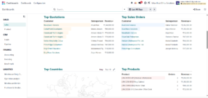
Scrolling further down the same dashboard reveals ranked tables such as Top Quotations and Top Sales Orders, each listing the customer, salesperson, and revenue value, so the highest-value opportunities and deals are visible immediately. Clicking on a customer or order in these tables opens the underlying record directly, letting a user move from a high-level figure straight into the details behind it.
The same page also includes Top Customers, Top Categories, Top Sales Teams, and Top Salespeople, giving a complete picture of who is generating revenue and which products or categories are performing best. The Top Categories panel can be toggled between a Tree Map view and a simple Top 10 list, and a similar toggle appears on other ranking widgets throughout the module, giving users a choice between a visual and a tabular representation of the same data.
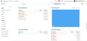
Taken together, this single Sales dashboard answers most of the questions a sales manager asks at the start of the day: how many quotations and orders came in, how much revenue was generated, which customers and salespeople are driving that revenue, and which regions or teams are contributing most.
Step 3: Analyze Product Performance
Switching to the Product dashboard under the Sales section shifts the focus from customers and salespeople to the products themselves. A Best Sellers by Revenue chart ranks products by the total revenue they generated within the selected period, and hovering over any bar shows the exact untaxed total for that product.
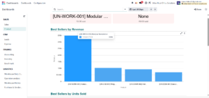
Below that, a Best Sellers by Units Sold chart and a Best Selling Products table break performance down by quantity as well as value, alongside a Best Selling Categories view. This makes it easy to spot whether a product is popular because of high unit sales, high pricing, or both — for example, a chair that sells in high volume at a lower price can be compared directly against a desk that sells fewer units but at a much higher value per order.
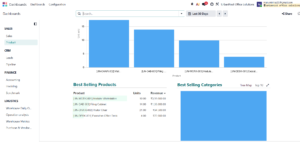
Because the Product dashboard uses the same date-range filter as the rest of the app, a manager can quickly check whether last month’s best sellers are still the current best sellers this month, which is useful for planning stock levels or deciding what to promote next.
Step 4: Track Leads on the CRM Dashboard
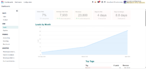
Under the CRM section, the Leads dashboard reports on pipeline health with KPI cards for Close Rate, Average Deal Size, Revenue, Days to Win, and Days to Assign. A Leads by Month chart shows how lead volume is trending, and a Top Tags table breaks leads down by category.
The Days to Win and Days to Assign figures are particularly useful for measuring process efficiency rather than just revenue: a rising average for either metric can indicate that leads are sitting untouched for too long before a salesperson is assigned, or that deals are taking longer than usual to close, both of which are easy to miss when only looking at total revenue.
Step 5: Monitor the Sales Pipeline
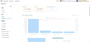
The Pipeline dashboard, also under CRM, focuses on open opportunities. It shows Expected and Closed revenue figures alongside the number of Open Opportunities, and a Top Opportunities chart that combines revenue value with the success probability of each deal — helping a sales manager prioritize which opportunities are closest to closing.
In the chart, revenue is shown as bars while the success percentage is overlaid as a line, so it is possible to see at a glance which large opportunities also have a high probability of closing and are therefore worth the most attention, versus large opportunities that are still early-stage and lower probability. Further down, an Expected Closing panel breaks upcoming revenue down by sales team, such as Sales versus Pre-Sales, to show which team’s pipeline is driving future results.
Step 6: Filter by Date Range
Every dashboard in the module shares the same date-range control in the top-right corner, shown as Last 30 Days or Last 90 Days in the figures above. Clicking this control opens a list of preset ranges and a custom option, and the arrows beside it move the selected window backward or forward one period at a time without needing to reopen the filter each time.
Because this control is consistent across every dashboard, a user who wants to compare, for example, this quarter’s sales performance against this quarter’s lead performance only needs to set the range once on each screen, and both dashboards will report on the same underlying time period.
Step 7: Share or Favorite a Dashboard
The Share button at the top of any dashboard allows the current view to be shared with other users in the database, which is useful when a manager wants a colleague to see the exact same figures rather than describing them in an email or a chat message.
The star icon next to Share marks a dashboard as a favorite. Favorited dashboards can be accessed more quickly the next time the app is opened, which is helpful for a user who checks the same one or two dashboards every day, such as the Sales overview or the Pipeline view.
Step 8: Move Between Departments
Because Sales, CRM, Finance, and Logistics dashboards all live in the same app and share the same left-hand menu, switching between them takes a single click rather than navigating to a different application. This is particularly useful during a management review, where a discussion might move from sales revenue, to the health of the CRM pipeline, to warehouse operations, all within the same screen and without losing context.
Advantages of the Dashboards Module
Using the built-in Dashboards module instead of building custom reports offers several practical benefits.
1. Centralized Visibility
All departments — Sales, CRM, Finance, and Logistics — can be reviewed from a single app instead of switching between modules.
2. Pre-Built, No Configuration Needed
Dashboards are ready to use as soon as the app is installed, with KPI cards, charts, and ranked tables already in place.
3. Real-Time Data
Every figure reflects live data from the connected apps and updates automatically as new records are created.
4. Flexible Date Ranges
Each dashboard can be filtered by period, such as Last 30 Days or Last 90 Days, to compare recent performance against historical trends.
5. Easy Sharing
Dashboards can be shared with colleagues or marked as favorites, making key reports accessible to the right people without rebuilding them.
6. Better Decision-Making
By surfacing top customers, top products, and pipeline health in one view, managers can make faster, better-informed decisions.
7. Drill-Down Into Records
Clicking on a customer, order, or product within a dashboard table opens the underlying record, so a figure never has to be taken at face value — the supporting detail is always one click away.
8. Scales With the Business
As more apps such as Purchase, Inventory, or Accounting are used, their data becomes available in the corresponding dashboards automatically, so the reporting layer grows with the business rather than requiring rework.
Who Should Use the Dashboards Module?
The Dashboards module is useful at almost every level of an organization, though different roles will focus on different screens:
- Sales managers monitor the Sales and Product dashboards to track revenue, orders, and best sellers.
- Sales representatives check Top Quotations and Top Opportunities to see where their own performance stands.
- CRM or business development teams use the Leads and Pipeline dashboards to manage lead flow and forecast closing revenue.
- Finance teams rely on the Accounting, Invoicing, and Benchmark dashboards for financial oversight.
- Operations and warehouse teams use the Logistics dashboards to track stock movement and vendor performance.
- General managers or business owners move across all of the above to get a single, company-wide view of performance.
Conclusion
The Dashboards module in Odoo 19 turns data that already exists inside Sales, CRM, Accounting, and other apps into something that can be understood in seconds rather than compiled manually. Because the dashboards are pre-built, organized by department, and filterable by date range, both individual users and management can rely on the same live figures without maintaining separate spreadsheets or reports.
For a business already running Odoo, enabling the Dashboards module is a low-effort way to gain immediate visibility into sales performance, product trends, and pipeline health, and to keep every team looking at the same, up-to-date numbers.




2 Comments